R Shiny ile İnteraktif Veri Analizi Uygulaması Geliştirme
UI/server mimarisinden reaktif programlamaya, çalışan bir satış dashboard'undan yayına almaya kadar R Shiny ile uygulama geliştirmeyi adım adım ele alıyorum.
- Araçlar
- Veri Görselleştirme
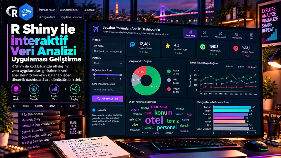
Statik bir raporda okuyucu hazır çıktıyı inceler. Shiny uygulamasında ise kullanıcı kendi sorusunu filtreler üzerinden sorar: bir bölge seçer, tarih aralığını daraltır, kategori değiştirir — ve buna bağlı bütün hesaplamalar ile görseller yenilenir.
R Shiny, R diliyle etkileşimli web uygulamaları geliştirmeyi sağlayan bir çerçeve. Analist veri hazırlama ve hesaplama mantığını R'da tutarken kullanıcıya filtreler, seçim kutuları, tarih aralıkları, tablolar ve grafikler içeren bir arayüz sunabiliyor. Bu yazıda UI/server ayrımından reaktif programlamaya, çalışan bir örnek uygulamadan yayına almaya kadar bütün akışı ele alıyorum.
“İyi tasarlanmış bir Shiny uygulaması, bir R analizinin üstüne konmuş birkaç kontrol öğesi değildir; veri mantığıyla kullanıcı deneyimini birleştiren küçük bir analitik üründür.”
1. Ne Zaman Shiny Geliştirmek Mantıklı?
Shiny özellikle kullanıcıların analiz parametrelerini değiştirebildiği, ancak hesaplama mantığının kontrollü kalması gereken durumlarda değerli. Uygulamaya başlamadan önce iki soruya cevap vermek gerekiyor: kullanıcılar hangi soruya cevap arıyor ve hangi veriye erişme yetkileri var?
Dashboard
Gelir, kârlılık, müşteri sayısı veya kampanya metriklerini tarih ve bölge filtreleriyle incelemek.
Karar aracı
Kullanıcının değişken seçip regresyon, dağılım veya güven aralığı çıktısını keşfetmesi.
Değerlendirme arayüzü
Farklı eşik ve parametrelerin tahmin performansına etkisini görmek.
Veri keşfi
Yüklenen dosyadaki eksikleri, özet istatistikleri ve olağan dışı gözlemleri incelemek.
2. UI ve Server: İki Temel Parça
Tipik bir Shiny uygulamasında UI kullanıcıya ne gösterileceğini tanımlar; server ise girdilere göre hangi işlemlerin yapılacağını ve çıktıların nasıl üretileceğini belirler. Küçük bir uygulama bu iki bölümü tek bir app.R dosyasında tutabilir.
UI — arayüz
selectInput(), dateRangeInput(), plotOutput() ve tableOutput() gibi bileşenleri yerleştirir. Giriş ve çıktı kimlikleri benzersiz olmalıdır.
Server — mantık
input$region gibi girdileri okur, reaktif ifadeler üretir ve output$plot gibi çıktıları render fonksiyonlarına bağlar.
library(shiny)

ui <- fluidPage(
  titlePanel("Örnek Analiz"),
  selectInput("segment", "Segment", choices = c("A", "B")),
  textOutput("result")
)

server <- function(input, output, session) {
  output$result <- renderText({
    paste("Seçilen segment:", input$segment)
  })
}

shinyApp(ui = ui, server = server)
Buradaki "segment" ve "result" kimlikleri UI ile server arasındaki bağın ta kendisi. Kimlikleri tutarlı yazmak ve tekrar kullanmamak, hata ayıklamayı belirgin biçimde kolaylaştırıyor.
3. Reaktif Programlama Nasıl Çalışır?
Reaktif programlama bir hesabı, onu etkileyen girdilerle ilişkilendirir. Girdi değiştiğinde Shiny yalnızca bağımlı çıktıları yeniden hesaplar; her etkileşimde uygulamanın bütün kodu baştan çalışmaz.
- SeçimKategori = Elektronik
- input$categoryDeğişiklik algılanır
- filtered_data()Veri filtrelenir
- renderPlot()Grafik hesaplanır
- Yeni grafikKullanıcı sonucu görür
| Fonksiyon | Rolü | Tipik kullanım |
|---|---|---|
reactive() | Girdilere bağlı hesaplanmış değer üretir. | Birden fazla çıktının kullandığı filtrelenmiş veri. |
renderPlot() | Grafik çıktısı üretir. | UI'daki plotOutput() ile eşleşir. |
renderTable() | Tablo çıktısı üretir. | UI'daki tableOutput() ile eşleşir. |
req() | Gerekli bir değerin varlığını bekler. | Eksik girdiyle devam edilmesini önlemek. |
validate(need()) | Anlaşılır doğrulama mesajı verir. | Filtre sonrası veri kalmadığında. |
reactive() yeniden kullanılabilir bir değer tanımlar ve yalnızca birisi ona ihtiyaç duyduğunda çalışır. observe() ise bir yan etki yürütmek içindir. Gereksiz observer'lar veri akışını izlemeyi zorlaştırır.4. Çalışan Örnek: Filtrelenebilir Satış Dashboard'u
Aşağıdaki uygulama kendi demo verisini üretiyor, yani dış dosyaya ihtiyaç duymadan çalıştırılabiliyor. Kullanıcı tarih aralığını, bölgeyi ve kategoriyi seçiyor; seçimler KPI metnini, aylık trend grafiğini, kategori grafiğini ve özet tabloyu birlikte güncelliyor.
shiny, dplyr ve ggplot2 paketlerini kullanıyor; |> yerel pipe operatörü R 4.1 ve sonrasını gerektiriyor.library(shiny)
library(dplyr)
library(ggplot2)
# Tekrar calistirildiginda ayni demo verisini uret
set.seed(42)
n <- 1200
sales <- data.frame(
date = sample(
seq(as.Date("2025-01-01"), as.Date("2026-12-31"), by = "day"),
n, replace = TRUE
),
region = sample(c("Marmara", "İç Anadolu", "Ege", "Akdeniz"), n, TRUE),
category = sample(c("Elektronik", "Ev", "Giyim", "Spor"), n, TRUE),
units = sample(1:8, n, TRUE),
unit_price = sample(c(250, 400, 650, 900, 1400, 2200), n, TRUE)
) |>
mutate(
revenue = units * unit_price,
cost = revenue * runif(n, min = 0.48, max = 0.78)
)
ui <- fluidPage(
titlePanel("Satış Performansı | İnteraktif Analiz"),
sidebarLayout(
sidebarPanel(
dateRangeInput(
"dates", "Tarih aralığı",
start = min(sales$date), end = max(sales$date),
min = min(sales$date), max = max(sales$date),
format = "dd/mm/yyyy"
),
selectInput(
"region", "Bölge",
choices = c("Tümü", sort(unique(sales$region))),
selected = "Tümü"
),
selectInput(
"category", "Kategori",
choices = c("Tümü", sort(unique(sales$category))),
selected = "Tümü"
)
),
mainPanel(
h3(textOutput("kpi")),
p("Filtrelere göre aylık gelir eğilimi"),
plotOutput("trend", height = "280px"),
p("Kategori bazında gelir"),
plotOutput("category_plot", height = "260px"),
h4("Filtrelenmiş kayıtlar"),
tableOutput("summary_table")
)
)
)
server <- function(input, output, session) {
filtered_data <- reactive({
req(input$dates)
df <- sales |>
filter(date >= input$dates[1], date <= input$dates[2])
if (input$region != "Tümü") {
df <- df |> filter(region == input$region)
}
if (input$category != "Tümü") {
df <- df |> filter(category == input$category)
}
validate(need(nrow(df) > 0, "Bu seçimlerde kayıt bulunamadı."))
df
})
output$kpi <- renderText({
df <- filtered_data()
paste0(
"Toplam gelir: ",
format(round(sum(df$revenue), 0), big.mark = ".", scientific = FALSE),
" TL | Adet: ", sum(df$units),
" | Kayıt: ", nrow(df)
)
})
output$trend <- renderPlot({
monthly <- filtered_data() |>
mutate(month = as.Date(format(date, "%Y-%m-01"))) |>
group_by(month) |>
summarise(revenue = sum(revenue), .groups = "drop")
ggplot(monthly, aes(x = month, y = revenue)) +
geom_line(color = "#8B7CFF", linewidth = 1.1) +
geom_point(color = "#62DFF2", size = 2) +
labs(x = NULL, y = "Gelir (TL)") +
theme_minimal(base_size = 12)
})
output$category_plot <- renderPlot({
category_data <- filtered_data() |>
group_by(category) |>
summarise(revenue = sum(revenue), .groups = "drop")
ggplot(category_data, aes(x = reorder(category, revenue), y = revenue)) +
geom_col(fill = "#62DFF2", width = 0.68) +
coord_flip() +
labs(x = NULL, y = "Gelir (TL)") +
theme_minimal(base_size = 12)
})
output$summary_table <- renderTable({
filtered_data() |>
group_by(region, category) |>
summarise(
revenue = sum(revenue),
units = sum(units),
transaction_rows = n(),
.groups = "drop"
) |>
arrange(desc(revenue))
})
}
shinyApp(ui = ui, server = server)5. Örnek Uygulama Nasıl Çalışıyor?
Demo veri
set.seed(42) aynı rastgele verinin tekrar üretilmesini sağlar. sales tablosu tarih, bölge, kategori, adet, gelir ve maliyet alanları içerir.
Kullanıcı girdileri
dateRangeInput() tarih aralığını, iki selectInput() ise bölge ve kategori seçimini sağlar.
Tek filtre kaynağı
filtered_data() seçili filtreleri bir kez uygular; KPI, iki grafik ve tablo aynı veri akışını kullanır.
Bağımlı çıktılar
Her çıktı filtered_data() değiştiğinde güncellenir; kullanıcı grafikleri elle yenilemez.
Tek bir reaktif kaynak kullanmanın görünmeyen bir faydası daha var: filtre mantığı dört ayrı yerde tekrarlanmadığı için bir kuralı değiştirmek istediğinizde tek bir yeri düzenlemeniz yeterli oluyor.
6. Prototipten Sürdürülebilir Uygulamaya
Uygulama büyüdükçe her bileşeni tek dosyada tutmak bakım maliyetini yükseltir. Shiny'nin modüler yapısı, tekrar kullanılan arayüz ve sunucu mantığını ayrı bileşenlere bölmeye yardımcı olur.
| Yaklaşım | Ne zaman düşünülür? | Katkısı |
|---|---|---|
| Shiny modülleri | Birden çok sayfa veya tekrar eden kontrol/çıktı grupları oluştuğunda | Sorumlulukları ayırır; test ve bakımı kolaylaştırır. |
eventReactive() | Hesaplama yalnızca kullanıcı butona bastığında çalışmalıysa | Ağır işlemlerin her küçük girdi değişiminde tetiklenmesini önler. |
| Önbellekleme | Aynı pahalı hesaplama aynı girdilerle sık tekrarlandığında | Uygun tasarımda yanıt süresini azaltır. |
| Testler | Metrikler iş kararlarını etkilediğinde | Filtre ve hesaplamalardaki regresyonları yakalar. |
Veri seti çok büyükse tüm dosyayı uygulama başlangıcında belleğe almak uygun olmayabilir. Sorguyu kaynağa göndermek, yalnızca gerekli kolonları seçmek veya ön hesaplanmış özetler kullanmak gerekebilir.
7. İyi Bir Uygulama Yalnızca Çalışmaz, Anlaşılır da Olur
Doğru sıra
Ana KPI'lar, temel grafikler ve ayrıntılar mantıklı bir sırada yer alsın.
Net etiketler
Varsayılan seçimin anlamı ve filtrelerin birbirini etkileyip etkilemediği açık olsun.
Açıklayıcı mesaj
Sonuç kalmadığında boş grafik veya teknik hata yerine açıklama gösterilsin.
Tutarlılık
Para, yüzde, tarih ve ondalık ayracı bütün çıktılarda aynı mantıkla gösterilsin.
Renge güvenme
Renk tek başına anlam taşımamalı; başlık, etiket ve açıklamalar da kullanılmalı.
Dar ekran
Uygulama dar ekranlarda da temel bilgiye ve filtrelere erişim sağlamalı.
8. Performans, Güvenlik ve Hata Yönetimi
Yerel bilgisayarda sorunsuz çalışan bir uygulama, birden fazla kullanıcı aynı anda bağlandığında yavaşlayabilir. Üretim öncesinde yalnızca ekranın görünüşü değil; eş zamanlı kullanıcı sayısı, veri hacmi ve arka plandaki hesaplamalar da değerlendirilmeli.
Gereksiz yükü azalt
Aynı hesaplamayı tekrarlamayın; pahalı işlemleri ölçün ve uygun yerde önbellek kullanın.
Sunucu tarafı
Yetkilendirme ve hassas veri erişimi sunucuda yönetilmeli; gizli anahtarlar kodun içine yazılmamalı.
İzlenebilirlik
Beklenen boş girdiler kullanıcıya anlaşılır mesajla sunulmalı, beklenmeyen hatalar kayda alınmalı.
Metrik sözlüğü
“Satış”, “aktif müşteri” veya “dönüşüm” nasıl hesaplanıyor? Tüm görsellerde aynı mantık kullanılmalı.
9. Shiny Uygulaması Nasıl Yayınlanır?
Geliştirme için yerel çalışma idealdir. Ekiplerin veya son kullanıcıların uygulamaya tarayıcıdan erişmesi gerekiyorsa uygulamanın bir barındırma ortamında çalışması gerekir.
Hızlı başlangıç
Geliştirme, demo ve kişisel analiz için yeterli.
Barındırma hizmeti
Kurulumun bir bölümü hizmet tarafından yönetilir; erişim ve maliyet koşulları incelenmeli.
Kendi sunucun
Ağ, kimlik doğrulama ve veri politikaları kurumun kontrolünde yapılandırılır.
install.packages(c("shiny", "dplyr", "ggplot2"))
shiny::runApp(".")
Dosyayı app.R adıyla kaydettikten sonra RStudio'daki Run App düğmesi de aynı işi görür. Barındırma seçimi yapılırken kullanıcı sayısı, veri hassasiyeti, işletim sorumluluğu, erişim yönetimi ve bütçe birlikte değerlendirilmeli.
10. Kontrol Listesi
İş ihtiyacı tanımlı
Uygulama hangi kararı destekliyor?
Metrikler doğrulandı
KPI tanımları ve filtre etkileri doğru mu?
Girdiler güvenli
Tarih aralığı, boş seçim ve beklenmeyen değerler ele alındı mı?
Reaktif akış sade
Aynı hesaplama gereksiz yere tekrarlanıyor mu?
Arayüz anlaşılır
Başlık, birim ve boş durum mesajları net mi?
Dağıtım planı var
Yetki, log, performans ve bakım sorumlusu belirlendi mi?
11. Sık Sorulan Sorular
| Soru | Yanıt |
|---|---|
| HTML, CSS ve JavaScript bilmek şart mı? | Temel uygulamalar yalnızca R ile kurulabilir. Daha özgün arayüz ve gelişmiş davranışlar gerektiğinde bu bilgiler ek esneklik sağlar. |
| Shiny sadece dashboard için mi? | Hayır. İstatistik hesaplayıcıları, model arayüzleri, veri inceleme araçları, simülasyonlar ve araştırma prototipleri de geliştirilebilir. |
| Büyük veriyle kullanılabilir mi? | Kullanılabilir; ancak veri hacmi, sorgu yaklaşımı, bellek kullanımı ve eş zamanlı kullanıcı sayısı mimariyi belirler. Büyük veriyi her oturumda belleğe almak yerine uygun sorgu stratejisi seçmek gerekir. |
Sonuç
R Shiny, hesaplama mantığını R ekosisteminde tutarken etkileşimli bir web arayüzü sunma imkânı veriyor. UI ve server ayrımı uygulamanın sorumluluklarını netleştiriyor; reaktif programlama ise kullanıcı seçimlerini ilgili analiz ve çıktılara bağlıyor.
İyi bir Shiny uygulaması yalnızca grafik göstermekle yetinmiyor. Doğru metrikleri, anlaşılır filtreleri, boş durum ve hata yönetimini, güvenliği ve performansı birlikte ele alıyor. Böyle tasarlandığında analiz çıktısı, kullanıcıların kendi sorularını keşfedebildiği bir karar destek aracına dönüşüyor.
“Statik rapor cevabı verir; iyi bir Shiny uygulaması kullanıcının soruyu kendisinin sormasına izin verir.”
In a static report the reader studies a finished output. In a Shiny application the user asks their own question through filters: they pick a region, narrow the date range, change a category — and every dependent calculation and chart refreshes.
R Shiny is a framework for building interactive web applications in R. The analyst keeps data preparation and calculation logic in R while offering the user an interface with filters, select boxes, date ranges, tables and charts. In this post I cover the whole flow: the UI/server split, reactive programming, a working example application, and publishing.
“A well-designed Shiny app is not a few controls bolted onto an R analysis; it is a small analytical product that joins data logic to user experience.”
1. When Does Building a Shiny App Make Sense?
Shiny is most valuable when users need to change analysis parameters but the calculation logic must stay under control. Before starting, two questions need answers: what question are users trying to answer, and what data are they allowed to see?
Dashboard
Reviewing revenue, profitability, customer counts or campaign metrics with date and region filters.
Decision tool
Letting the user pick variables and explore regression, distribution or confidence interval output.
Evaluation interface
Seeing how different thresholds and parameters affect prediction performance.
Data exploration
Inspecting missing values, summary statistics and unusual observations in an uploaded file.
2. UI and Server: The Two Core Parts
In a typical Shiny app the UI defines what the user sees, while the server defines what happens with the inputs and how outputs are produced. A small application can keep both parts in a single app.R file.
UI — the interface
Places components such as selectInput(), dateRangeInput(), plotOutput() and tableOutput(). Input and output IDs must be unique.
Server — the logic
Reads inputs such as input$region, builds reactive expressions, and binds outputs like output$plot to render functions.
library(shiny)

ui <- fluidPage(
  titlePanel("Example Analysis"),
  selectInput("segment", "Segment", choices = c("A", "B")),
  textOutput("result")
)

server <- function(input, output, session) {
  output$result <- renderText({
    paste("Selected segment:", input$segment)
  })
}

shinyApp(ui = ui, server = server)
The IDs "segment" and "result" are the link between UI and server. Writing them consistently, and never reusing one, makes debugging markedly easier.
3. How Reactive Programming Works
Reactive programming ties a calculation to the inputs that affect it. When an input changes, Shiny recomputes only the dependent outputs; the whole application does not run again on every interaction.
- SelectionCategory = Electronics
- input$categoryChange detected
- filtered_data()Data is filtered
- renderPlot()Chart is computed
- New chartUser sees the result
| Function | Role | Typical use |
|---|---|---|
reactive() | Produces a computed value that depends on inputs. | Filtered data used by several outputs. |
renderPlot() | Produces a chart output. | Paired with plotOutput() in the UI. |
renderTable() | Produces a table output. | Paired with tableOutput() in the UI. |
req() | Waits for a required value to exist. | Preventing execution with a missing input. |
validate(need()) | Gives a readable validation message. | When no data is left after filtering. |
reactive() defines a reusable value and only runs when something needs it. observe() exists to carry out a side effect. Unnecessary observers make the data flow harder to follow.4. A Working Example: A Filterable Sales Dashboard
The application below generates its own demo data, so it runs without any external file. The user picks a date range, a region and a category; those selections update the KPI line, the monthly trend chart, the category chart and the summary table together.
shiny, dplyr and ggplot2 packages; the native |> pipe requires R 4.1 or later.library(shiny)
library(dplyr)
library(ggplot2)
# Reproduce the same demo data on every run
set.seed(42)
n <- 1200
sales <- data.frame(
date = sample(
seq(as.Date("2025-01-01"), as.Date("2026-12-31"), by = "day"),
n, replace = TRUE
),
region = sample(c("Marmara", "Central Anatolia", "Aegean", "Mediterranean"), n, TRUE),
category = sample(c("Electronics", "Home", "Apparel", "Sports"), n, TRUE),
units = sample(1:8, n, TRUE),
unit_price = sample(c(250, 400, 650, 900, 1400, 2200), n, TRUE)
) |>
mutate(
revenue = units * unit_price,
cost = revenue * runif(n, min = 0.48, max = 0.78)
)
ui <- fluidPage(
titlePanel("Sales Performance | Interactive Analysis"),
sidebarLayout(
sidebarPanel(
dateRangeInput(
"dates", "Date range",
start = min(sales$date), end = max(sales$date),
min = min(sales$date), max = max(sales$date),
format = "dd/mm/yyyy"
),
selectInput(
"region", "Region",
choices = c("All", sort(unique(sales$region))),
selected = "All"
),
selectInput(
"category", "Category",
choices = c("All", sort(unique(sales$category))),
selected = "All"
)
),
mainPanel(
h3(textOutput("kpi")),
p("Monthly revenue trend for the current filters"),
plotOutput("trend", height = "280px"),
p("Revenue by category"),
plotOutput("category_plot", height = "260px"),
h4("Filtered records"),
tableOutput("summary_table")
)
)
)
server <- function(input, output, session) {
filtered_data <- reactive({
req(input$dates)
df <- sales |>
filter(date >= input$dates[1], date <= input$dates[2])
if (input$region != "All") {
df <- df |> filter(region == input$region)
}
if (input$category != "All") {
df <- df |> filter(category == input$category)
}
validate(need(nrow(df) > 0, "No records match this selection."))
df
})
output$kpi <- renderText({
df <- filtered_data()
paste0(
"Total revenue: ",
format(round(sum(df$revenue), 0), big.mark = ",", scientific = FALSE),
" | Units: ", sum(df$units),
" | Rows: ", nrow(df)
)
})
output$trend <- renderPlot({
monthly <- filtered_data() |>
mutate(month = as.Date(format(date, "%Y-%m-01"))) |>
group_by(month) |>
summarise(revenue = sum(revenue), .groups = "drop")
ggplot(monthly, aes(x = month, y = revenue)) +
geom_line(color = "#8B7CFF", linewidth = 1.1) +
geom_point(color = "#62DFF2", size = 2) +
labs(x = NULL, y = "Revenue") +
theme_minimal(base_size = 12)
})
output$category_plot <- renderPlot({
category_data <- filtered_data() |>
group_by(category) |>
summarise(revenue = sum(revenue), .groups = "drop")
ggplot(category_data, aes(x = reorder(category, revenue), y = revenue)) +
geom_col(fill = "#62DFF2", width = 0.68) +
coord_flip() +
labs(x = NULL, y = "Revenue") +
theme_minimal(base_size = 12)
})
output$summary_table <- renderTable({
filtered_data() |>
group_by(region, category) |>
summarise(
revenue = sum(revenue),
units = sum(units),
transaction_rows = n(),
.groups = "drop"
) |>
arrange(desc(revenue))
})
}
shinyApp(ui = ui, server = server)5. How the Example Works
Demo data
set.seed(42) makes the random sample reproducible. The sales table holds date, region, category, units, revenue and cost.
User inputs
dateRangeInput() provides the date range; two selectInput() controls provide region and category.
One filter source
filtered_data() applies the selected filters once; the KPI, both charts and the table share the same data flow.
Dependent outputs
Every output updates when filtered_data() changes; the user never refreshes a chart by hand.
A single reactive source has one more benefit that is easy to miss: because the filter logic is not repeated in four places, changing a rule means editing exactly one spot.
6. From Prototype to Maintainable Application
As an application grows, keeping every component in one file raises the maintenance cost. Shiny's modular structure helps split reusable interface and server logic into separate components.
| Approach | When to consider it | What it gives |
|---|---|---|
| Shiny modules | When there are several pages or repeated control/output groups | Separates responsibilities; makes testing and maintenance easier. |
eventReactive() | When a calculation should run only after the user clicks a button | Stops heavy work from firing on every small input change. |
| Caching | When the same expensive calculation repeats with the same inputs | Reduces response time when designed properly. |
| Tests | When the metrics drive business decisions | Catches regressions in filters and calculations. |
If the data set is very large, loading the whole file into memory at startup may not be appropriate. Pushing the query to the source, selecting only the needed columns, or using pre-computed summaries may be necessary.
7. A Good Application Does Not Just Work — It Is Understandable
The right order
Main KPIs, core charts and details should appear in a sensible sequence.
Clear labels
What the default selection means, and whether filters affect one another, should be obvious.
An explanation
When nothing is left, show a message rather than an empty chart or a technical error.
Consistency
Currency, percentages, dates and decimal separators should follow the same rule everywhere.
Not color alone
Color should not carry meaning on its own; titles, labels and captions matter too.
Narrow screens
The application should still give access to the key figures and filters on a small screen.
8. Performance, Security and Error Handling
An application that runs smoothly on a local machine can slow down once several users connect at the same time. Before production, it is not only the look of the screen that matters but also concurrent users, data volume and the work happening in the background.
Reduce needless work
Do not repeat the same calculation; measure expensive operations and cache where it fits.
Server side
Authorization and access to sensitive data belong on the server; secrets must never be written into the code.
Traceability
Expected empty inputs should produce a readable message; unexpected errors should be logged.
A metric glossary
How are “sales”, “active customer” or “conversion” computed? The same logic must hold across every visual.
9. Publishing a Shiny Application
Running locally is ideal for development. If teams or end users need to reach the application from a browser, it has to run in a hosting environment.
Quick start
Enough for development, demos and personal analysis.
Hosting service
Part of the setup is handled by the service; access and cost terms should be reviewed.
Your own server
Network, authentication and data policies are configured under the organization's control.
install.packages(c("shiny", "dplyr", "ggplot2"))
shiny::runApp(".")
Saving the file as app.R and pressing Run App in RStudio does the same thing. When choosing where to host, weigh user count, data sensitivity, operational responsibility, access management and budget together.
10. Checklist
Business need defined
Which decision does the application support?
Metrics verified
Are the KPI definitions and filter effects correct?
Inputs are safe
Are date ranges, empty selections and unexpected values handled?
Reactive flow is simple
Is the same calculation repeated unnecessarily?
Interface is clear
Are titles, units and empty-state messages unambiguous?
Deployment plan exists
Are permissions, logs, performance and ownership settled?
11. Frequently Asked Questions
| Question | Answer |
|---|---|
| Do I need HTML, CSS and JavaScript? | Basic applications can be built in R alone. Those skills add flexibility when you need a more custom interface or advanced behaviour. |
| Is Shiny only for dashboards? | No. Statistical calculators, model interfaces, data inspection tools, simulations and research prototypes can all be built with it. |
| Can it handle large data? | Yes, but data volume, query approach, memory use and concurrent users shape the architecture. Rather than loading large data into memory every session, pick a suitable query strategy. |
Conclusion
R Shiny lets you keep the calculation logic in the R ecosystem while offering an interactive web interface. The UI/server split clarifies the application's responsibilities, and reactive programming connects user choices to the relevant analysis and outputs.
A good Shiny application does more than draw a chart. It handles the right metrics, clear filters, empty states and errors, security and performance together. Designed that way, an analysis becomes a decision-support tool where users can explore their own questions.
“A static report gives the answer; a good Shiny app lets the user ask the question.”