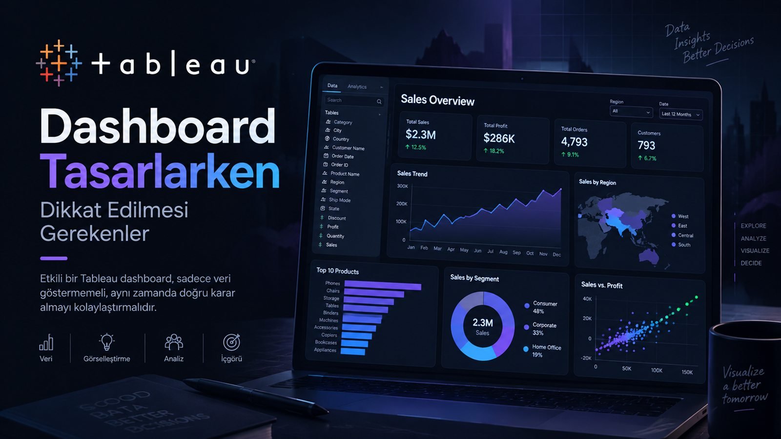
Power BI Dashboard Tasarlarken Dikkat Edilmesi Gerekenler
Etkili bir dashboard, sadece veri göstermekle kalmaz; aynı zamanda doğru karar almayı kolaylaştırmalıdır. Bu yazıda dikkat edilmesi gereken temel noktaları paylaşıyorum.
- Veri Görselleştirme
- Araçlar
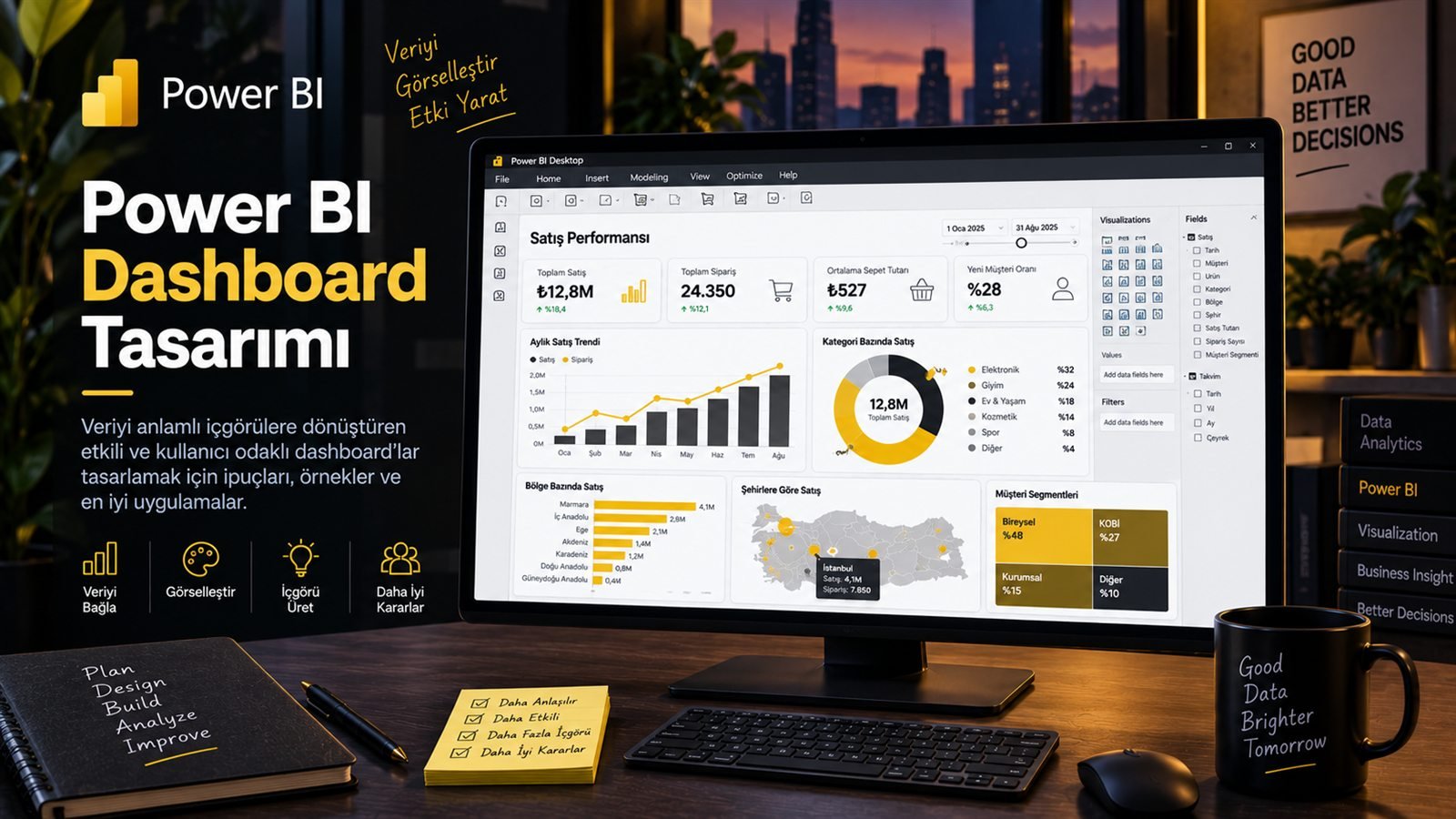
Bir Power BI dashboard hazırlamak, birkaç grafik ekleyip sayfayı görsel olarak doldurmaktan çok daha fazlası. İyi bir dashboard; doğru KPI'ları öne çıkarır, bilgiyi bir hiyerarşi içinde sunar ve kullanıcının birkaç saniye içinde “Ne oldu?” sorusuna cevap vermesine yardımcı olur.
Benim için dashboard tasarımındaki temel soru şu: Bu ekranı açan kişi burada hangi kararı verecek? Çünkü tasarımı belirleyen şey kullanılan grafik türünden çok, çözülmek istenen problemdir.
“İyi dashboard daha fazla grafik göstermez; doğru bilgiyi daha hızlı gösterir.”
Power BI Dashboard Nedir?
Dashboard; farklı veri kaynaklarından gelen önemli göstergeleri tek bir ekranda özetleyen ve kullanıcıya hızlı bir karar destek alanı sunan görsel bir raporlama yapısıdır.
- Veri
- KPI
- Görselleştirme
- Filtre
- Karar
1. Önce Kullanıcıyı Tanımla
Dashboard tasarımının ilk adımı grafik seçmek değil, kullanıcıyı anlamak. Bir üst yönetim dashboard'u ile operasyon ekibinin kullandığı dashboard aynı şekilde tasarlanmamalı.
Özet ve KPI
Az sayıda ama kritik gösterge, trend ve istisnalar öne çıkarılmalı.
Detay ve aksiyon
Filtreleme, detay kırılımları ve günlük takip daha önemli olabilir.
Keşif
Daha fazla boyut ve etkileşimli analiz imkânı gerekebilir.
Basit anlatım
Teknik detaydan çok anlaşılır sonuçlar ön plana çıkmalı.
2. KPI'ları Doğru Seçmek
Dashboard'ın üst bölümünde yer alan KPI kartları kullanıcının ilk baktığı alanlardan biri. Burada onlarca metrik göstermek yerine gerçekten karar süreçlerini etkileyen metrikleri seçmek daha iyi sonuç verir.
3. Doğru Grafik Türünü Kullanmak
Her veri için aynı grafik türünü kullanmak, veriyi anlatmak yerine karmaşıklaştırabilir. Grafik seçimi sorulan soruya göre yapılmalı.
| Soru | Uygun grafik | Amaç |
|---|---|---|
| Zaman içinde ne oldu? | Çizgi grafik | Trend görmek |
| Hangi kategori daha yüksek? | Çubuk grafik | Karşılaştırmak |
| Dağılım nasıl? | Histogram / boxplot | Dağılımı anlamak |
| İki değişken ilişkili mi? | Scatter plot | İlişkiyi görmek |
| Toplamın parçaları neler? | Stacked bar | Bileşenleri karşılaştırmak |
4. Dashboard'un Görsel Hiyerarşisini Kurmak
Kullanıcı ekranı soldan sağa ve yukarıdan aşağıya tararken önemli bilgiler doğru sırada karşısına çıkmalı. Kritik KPI'lar genellikle üst bölümde; detaylı grafikler ve tablolar daha aşağıda konumlandırılabilir.
5. Renkleri Amaçlı Kullanmak
Dashboard tasarımında en sık yapılan hatalardan biri fazla renk kullanmak. Renk sadece dekorasyon için değil, bilgi taşımak için kullanılmalı.
6. Filtreler ve Etkileşim Tasarımı
Power BI'ın güçlü taraflarından biri etkileşim. Ancak her filtreyi aynı anda eklemek dashboard'u karmaşıklaştırabilir. Kullanıcının en sık değiştireceği filtreleri görünür, ikincil filtreleri ise daha kontrollü sunmak daha iyi bir deneyim yaratabilir.
- Tarih
- Bölge
- Kategori
- Detay
7. DAX ve Ölçü Tasarımı
Dashboard kalitesinin arka planında sadece tasarım değil, doğru ölçülerin oluşturulması da var. DAX ölçülerini raporun ihtiyacına göre anlamlı, tekrar kullanılabilir ve mümkün olduğunca performanslı tasarlamak gerekiyor.
Toplam Satis =
SUM(Satis[NetSatis])

Satis Buyumesi =
DIVIDE(
    [Toplam Satis] - [Gecen Yil Satis],
    [Gecen Yil Satis]
)
Önemli olan sadece formülün çalışması değil; ölçünün hangi filtre bağlamında çalıştığını ve dashboard'daki diğer görsellerle nasıl etkileşeceğini anlamak.
8. Dashboard Performansını Unutmamak
Çok fazla görsel, karmaşık DAX ölçüleri ve gereksiz veri yükü dashboard'un açılış ve etkileşim performansını düşürebilir. Bu nedenle tasarım ile model performansı birlikte düşünülmeli.
Gereksiz kolonları azalt
Raporda kullanılmayan veriyi mümkün olduğunca modele taşımamaya çalış.
Ölçüleri sadeleştir
Tekrar eden ve gereksiz karmaşık hesaplamalardan kaçın.
Görsel sayısını kontrol et
Her görselin gerçekten bir soruya cevap verdiğinden emin ol.
İlişkileri düzenle
Sağlıklı bir veri modeli, rapor performansının temelini oluşturur.
9. Dashboard'u Test Etmek
Dashboard tamamlandığında sadece tasarımına bakmak yetmez. Gerçek kullanıcı gibi davranarak birkaç farklı senaryo test edilmeli.
En Sık Yapılan Dashboard Hataları
| Hata | Problem | Daha iyi yaklaşım |
|---|---|---|
| Çok fazla grafik | Göz yorulur, ana mesaj kaybolur. | Her görselin bir soruya cevap vermesini sağlamak. |
| Fazla renk | Görsel hiyerarşi bozulur. | Az ve anlamlı renk kullanmak. |
| KPI kalabalığı | Öncelik belirlemek zorlaşır. | En kritik göstergeleri öne almak. |
| Detay odaklı tasarım | Yönetici hızlı içgörüyü kaçırabilir. | Özet → trend → detay hiyerarşisi kurmak. |
| Performansı düşünmemek | Yavaş rapor kullanıcı deneyimini bozar. | Model, DAX ve görselleri birlikte optimize etmek. |
Benim İçin İyi Bir Dashboard'un Özeti
Bir Power BI dashboard hazırlarken kendime birkaç basit soru soruyorum:
Ne oldu?
Kullanıcı mevcut durumu birkaç saniyede görebiliyor mu?
Neden oldu?
Detaya inmek ve nedeni araştırmak mümkün mü?
Ne yapmalıyım?
Dashboard karar vermeyi veya aksiyon almayı kolaylaştırıyor mu?
Güvenebilir miyim?
Veri, ölçüler ve hesaplamalar doğrulanmış mı?
Sonuç
Power BI ile dashboard tasarlamak sadece teknik olarak çalışan grafikler oluşturmak değil. Veri modeli, DAX ölçüleri, görsel hiyerarşi, renk kullanımı, filtreler, performans ve kullanıcı deneyimi birlikte düşünülmeli.
Benim için iyi bir dashboard'un temel amacı şu: veriyi göstermek değil, kullanıcıyı doğru karara mümkün olan en kısa yoldan götürmek.
“Dashboard tasarımında başarı, kaç grafik kullandığınızla değil; kullanıcının doğru içgörüye ne kadar hızlı ulaştığıyla ölçülür.”
Building a Power BI dashboard is much more than adding a few charts and filling the page visually. A good dashboard highlights the right KPIs, presents information in a hierarchy and helps users answer “What happened?” within a few seconds.
For me, the key question in dashboard design is: What decision will the person who opens this screen make here? Because what shapes the design is the problem to be solved, more than the chart type used.
“A good dashboard doesn’t show more charts; it shows the right information faster.”
What Is a Power BI Dashboard?
A dashboard is a visual reporting structure that summarizes key indicators from different data sources on a single screen and gives users a quick decision-support space.
- Data
- KPI
- Visualization
- Filter
- Decision
1. Define the User First
The first step of dashboard design is not choosing charts but understanding the user. A top management dashboard and one used by an operations team should not be designed the same way.
Summary and KPIs
A small number of critical indicators, trends and exceptions should stand out.
Detail and action
Filtering, detailed breakdowns and daily tracking may matter more.
Exploration
More dimensions and interactive analysis may be needed.
Simple storytelling
Clear results should come before technical detail.
2. Choosing the Right KPIs
KPI cards at the top of a dashboard are one of the first places users look. Rather than showing dozens of metrics there, choosing the ones that truly affect decisions gives better results.
3. Using the Right Chart Type
Using the same chart type for every kind of data can complicate the story instead of telling it. Charts should be chosen based on the question being asked.
| Question | Suitable chart | Purpose |
|---|---|---|
| What happened over time? | Line chart | See the trend |
| Which category is higher? | Bar chart | Compare |
| What does the distribution look like? | Histogram / boxplot | Understand the distribution |
| Are two variables related? | Scatter plot | See the relationship |
| What are the parts of the total? | Stacked bar | Compare components |
4. Building the Dashboard’s Visual Hierarchy
As users scan the screen from left to right and top to bottom, important information should appear in the right order. Critical KPIs usually go at the top; detailed charts and tables can sit further down.
5. Using Color with Purpose
One of the most common dashboard design mistakes is using too many colors. Color should carry information, not just decorate.
6. Filters and Interaction Design
Interactivity is one of Power BI’s strengths. But adding every filter at once can make a dashboard complicated. Keeping the filters users change most often visible and presenting secondary filters in a more controlled way creates a better experience.
- Date
- Region
- Category
- Detail
7. DAX and Measure Design
Behind dashboard quality there is not only design but also building the right measures. DAX measures should be designed to be meaningful, reusable and as performant as possible for the report’s needs.
Total Sales =
SUM(Sales[NetSales])

Sales Growth =
DIVIDE(
    [Total Sales] - [Last Year Sales],
    [Last Year Sales]
)
What matters is not only that the formula works, but understanding which filter context the measure runs in and how it interacts with the other visuals on the dashboard.
8. Don’t Forget Dashboard Performance
Too many visuals, complex DAX measures and unnecessary data load can slow down how fast a dashboard opens and responds. That is why design and model performance should be considered together.
Reduce unnecessary columns
Try not to bring data the report does not use into the model.
Simplify measures
Avoid repeated and unnecessarily complex calculations.
Control the number of visuals
Make sure every visual really answers a question.
Organize relationships
A healthy data model is the foundation of report performance.
9. Testing the Dashboard
When the dashboard is finished, looking at its design is not enough. Several scenarios should be tested by acting like a real user.
The Most Common Dashboard Mistakes
| Mistake | Problem | Better approach |
|---|---|---|
| Too many charts | Eyes get tired and the main message is lost. | Make every visual answer a question. |
| Too many colors | The visual hierarchy breaks down. | Use few, meaningful colors. |
| KPI overload | Setting priorities becomes hard. | Bring the most critical indicators forward. |
| Detail-driven design | Managers may miss the quick insight. | Build a summary → trend → detail hierarchy. |
| Ignoring performance | A slow report hurts the user experience. | Optimize the model, DAX and visuals together. |
My Summary of a Good Dashboard
When I build a Power BI dashboard, I ask myself a few simple questions:
What happened?
Can the user see the current situation in a few seconds?
Why did it happen?
Is it possible to drill down and investigate the cause?
What should I do?
Does the dashboard make decisions or actions easier?
Can I trust it?
Have the data, measures and calculations been validated?
Conclusion
Designing a dashboard in Power BI is not just about building charts that work technically. The data model, DAX measures, visual hierarchy, use of color, filters, performance and user experience should all be considered together.
For me, the core purpose of a good dashboard is this: not to show data, but to lead users to the right decision by the shortest possible route.
“Success in dashboard design is not measured by how many charts you use, but by how quickly users reach the right insight.”