Yönetim Dashboard'u: Bir Yılın Satışı Üç SayfadaExecutive Dashboard: A Year of Sales on Three Pages
Bir milyon satırlık satış verisinden Power BI'da üç sayfalık bir yönetim dashboard'u kurdum: yıldız şema, 17 DAX ölçüsü ve Python'la doğrulanmış rakamlar. Grafikler bu sayfada etkileşimli.I built a three-page executive dashboard in Power BI from one million rows of sales: a star schema, 17 DAX measures and figures verified against Python. The charts on this page are interactive.
- Power BI
- DAX
- Python
- Parquet
Yönetim bir dashboard'a üç soruyla bakar: ciro nasıl gidiyor, müşteri kim, para nerede kaçıyor? Bir online perakendecinin iki yıllık satış verisinden bu üç soruya cevap veren üç sayfalık bir Power BI dashboard'u kurdum.
Veri modeli
Veri, müşteri segmentasyonu çalışmasında kullandığım açık Online Retail II veri seti. Bu kez müşteri numarası olmayan satışları da tuttum, çünkü yönetim raporunda toplam ciro eksik görünmemeli. Python'da veriyi yıldız şemaya çevirdim: ortada satış satırları, çevresinde üç boyut tablosu.
| Tablo | Satır | İçerik |
|---|---|---|
| Satis | 1.021.128 | Fatura, tarih, saat, müşteri, ürün, adet, ciro, iade işareti |
| Musteri | 5.875 | Ülke, ilk alışveriş tarihi, segment |
| Urun | 4.721 | Ürün kodu ve adı |
| Tarih | 1.095 | Yıl, ay, çeyrek, haftanın günü |
- CSV yerine Parquet. Sütun tipleri dosyayla birlikte geliyor. Türkçe bölge ayarında CSV'deki 2.55 gibi ondalıklar yanlış okunabiliyor.
- Segmentler modele taşındı. Müşteri tablosundaki segment sütunu önceki çalışmadan geliyor; dashboard'daki segment kırılımları buna dayanıyor.
- Ayrı tarih tablosu. Geçen yıl karşılaştırmaları için bir takvim tablosu kurup tarih tablosu olarak işaretledim. Ay ve gün adları numara sütunlarına göre sıralanıyor.
Ölçüler
17 ölçünün tamamı birkaç temel ölçünün üzerine kurulu. Dört örnek:
Net Ciro = SUM ( Satis[Ciro] )

İade Oranı = DIVIDE ( [İade Tutarı], [Brüt Ciro] )

Geçen Yıl Net Ciro = CALCULATE ( [Net Ciro], SAMEPERIODLASTYEAR ( Tarih[Tarih] ) )

Aktif Müşteri = CALCULATE ( DISTINCTCOUNTNOBLANK ( Satis[MusteriNo] ), Satis[IadeMi] = 0 )
İadeler veride eksi tutarlı satırlar olarak duruyor. Net ciro bunları düşüyor, brüt ciro saymıyor; iade oranı iade tutarının brüt ciroya bölümü. Formüllerin mantığı için DAX yazısına bakabilirsiniz.
Dashboard
Raporun üç sayfası aşağıda. Sekmelerle sayfa, üstteki düğmelerle yıl değiştirilebiliyor; grafiklerin üzerine gelince değerler görünüyor, “Tablo görünümü” aynı rakamları tablo olarak veriyor.
Sonraki üç bölümdeki bulgular 2011 yılı için. Yılı 2010'a çevirip karşılaştırabilirsiniz.
Sayfa 1: Genel Bakış
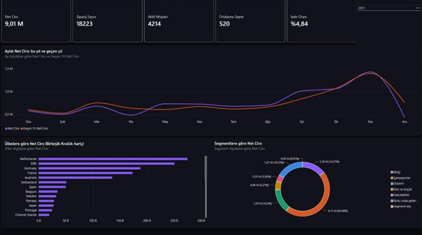
Beş kart yılın özetini veriyor. Çizgi grafik her ayı geçen yılın aynı ayıyla karşılaştırıyor.
- Ciro düşmüş gibi görünüyor. 2011 net cirosu £9.012.895, 2010'unki £9.135.191: %1,34 düşüş. Ama veri 9 Aralık 2011'de bitiyor. Ocak–Kasım karşılaştırmasında 2011 %2,33 önde; grafikte iki çizgi Kasım'a kadar birlikte gidiyor, Aralık'ta ayrılıyor.
- Cironun %84'ü tek ülkeden. Birleşik Krallık'ı çubuk grafikte hariç tuttum; aksi halde diğer 36 ülke görünmüyor. Kalanların başında Hollanda (£274.725) ve İrlanda (£250.700) var.
- Şampiyonlar cironun %45,9'u. Segment grafiği, segmentasyon çalışmasındaki grupların 2011 cirosundaki payını gösteriyor.
Genel Bakış sayfasını dashboard'da aç ↑
Sayfa 2: Müşteriler
2011'de 4.214 müşteri alışveriş yaptı; 1.537 tanesi ilk kez geldi. Müşteri başına ortalama ciro £1.831.
- Az müşteri, çok ciro. Şampiyonlar aktif müşterilerin %16'sı (672 müşteri), cironun %45,9'u.
- İkinci yılda gelenler. İlk yıl hiç alışveriş yapmamış 1.579 müşteri 2011 cirosunun %16,3'ünü getirdi.
- Aylık satışı eski müşteri taşıyor. En çok yeni müşterinin geldiği Ekim'de bile 1.361 aktif müşterinin yalnızca 221 tanesi yeni.
- Müşterisiz satışlar. Cironun %14,4'ü müşteri numarası olmayan satışlardan geliyor. Bunu ayrı bir kartta tuttum; segment grafiklerinde ayrı bir satır olarak görünüyor.
Müşteriler sayfasını dashboard'da aç ↑
Sayfa 3: Ürünler ve İadeler
İade oranı 2010'da %2,54 iken 2011'de %4,84: neredeyse iki katı. Aylık grafik nedenini gösteriyor. Oran on ay boyunca %1,2 ile %6,5 arasında kalıyor, Ocak'ta %13,7'ye, Aralık'ta %28,3'e çıkıyor.
İade çubuğu iki ürünü öne çıkarıyor. İkisi de verildiği gün iptal edilen tek bir dev sipariş: 18 Ocak'ta 74.215 adet seramik saklama kabı (£77.184) ve 9 Aralık'ta 80.995 adet kâğıt kuş süsü (£168.470).
Isı haritası siparişlerin ne zaman geldiğini gösteriyor: en yoğun saat öğle 12, en yoğun gün Perşembe (3.814 sipariş). Cumartesi günü hiç sipariş yok; Pazar siparişleri 10 ile 16 arasında toplanıyor.
Ürünler ve İadeler sayfasını dashboard'da aç ↑
Power BI'daki görünüm
Yukarıdaki grafikler, Power BI raporundaki görsellerin aynı veriden bu sayfada yeniden çizilmiş hali. Rakamlar aynı; birkaç görselin biçimi farklı (örneğin Power BI'daki segment halkası burada çubuk). Raporun Power BI Desktop'taki ilk sayfası:
Rakamları doğrulama
Bir dashboard, rakamları yanlışken de düzgün görünür. Bu yüzden temel ölçüleri Python'da (pandas) ayrıca hesapladım ve Power BI'daki değerle karşılaştırdım.
| Ölçü (2011) | Python | Power BI |
|---|---|---|
| Net Ciro | 9.012.895 | 9.012.895 |
| Geçen Yıl Net Ciro | 9.135.191 | 9,14 M |
| Sipariş Sayısı | 18.223 | 18.223 |
| Aktif Müşteri | 4.214 | 4.214 |
| Yeni Müşteri | 1.537 | 1.537 |
| Ortalama Sepet | 519,74 | 520 |
| İade Oranı | %4,84 | %4,84 |
| Müşterisiz Ciro Payı | %14,37 | %14,37 |
Power BI sütunundaki yuvarlak değerler kartların gösterdiği biçim; tutarlar sterlin.
İlk karşılaştırmada “Geçen Yıl Net Ciro” bu yılın cirosuyla aynı çıkıyordu: satış ve tarih tabloları arasındaki ilişki eksikti. Grafik düzgün görünüyordu; hatayı kontrol rakamı yakaladı.
Sınırlar
Sonuç
İki rakam tek başına okunduğunda yanlış sonuca götürüyordu: “ciro düştü” yarım bir Aralık'tı, “iadeler ikiye katlandı” iki iptaldi. İkisi de yanındaki grafik sayesinde açıklığa kavuştu. Dashboard tasarlarken en çok buna dikkat ettim: her özet rakamın yanında onu açıklayan bir kırılım olsun.
Benim için en öğretici kısım, modelin görselden önce geldiğini görmek oldu. Eksik bir ilişki ya da iki kez yazılmış bir ürün kodu, görseller ne kadar düzgün olursa olsun yanlış rakam üretiyor.
Veri: Chen, D. (2019). Online Retail II. UCI Machine Learning Repository. Tutarlar sterlin cinsindendir. Ekran görüntüsü 2011 yılı seçiliyken alındı.
Management looks at a dashboard with three questions: how is revenue doing, who are the customers, and where is money leaking? From two years of an online retailer's sales I built a three-page Power BI dashboard that answers them.
Data model
The data is the open Online Retail II dataset I used in the customer segmentation study. This time I kept the sales without a customer ID, because total revenue must not look incomplete in a management report. In Python I reshaped the data into a star schema: sales rows in the middle, three dimension tables around them.
| Table | Rows | Contents |
|---|---|---|
| Satis (sales) | 1,021,128 | Invoice, date, hour, customer, product, quantity, revenue, return flag |
| Musteri (customers) | 5,875 | Country, first purchase date, segment |
| Urun (products) | 4,721 | Product code and name |
| Tarih (calendar) | 1,095 | Year, month, quarter, day of week |
- Parquet instead of CSV. Column types travel with the file. Under Turkish regional settings, decimals such as 2.55 in a CSV can be misread.
- Segments carried into the model. The segment column in the customer table comes from the earlier study; the dashboard's segment breakdowns rely on it.
- A separate date table. For year-over-year comparisons I built a calendar table and marked it as the date table. Month and day names sort by their number columns.
Measures
All 17 measures are built on a few base measures. Four examples:
Net Ciro = SUM ( Satis[Ciro] )

İade Oranı = DIVIDE ( [İade Tutarı], [Brüt Ciro] )

Geçen Yıl Net Ciro = CALCULATE ( [Net Ciro], SAMEPERIODLASTYEAR ( Tarih[Tarih] ) )

Aktif Müşteri = CALCULATE ( DISTINCTCOUNTNOBLANK ( Satis[MusteriNo] ), Satis[IadeMi] = 0 )
Returns sit in the data as rows with negative amounts. Net revenue deducts them, gross revenue leaves them out, and the return rate is the returned amount divided by gross revenue. The DAX post covers the logic behind the formulas.
Dashboard
The report's three pages are below. The tabs switch pages and the buttons above switch the year; hover over a chart to see the values, and “Table view” gives the same figures as tables.
The findings in the next three sections are for 2011. Switch the year to 2010 to compare.
Page 1: Overview
Five cards summarize the year. The line chart compares each month with the same month a year earlier.
- Revenue appears to have fallen. Net revenue was £9,012,895 in 2011 and £9,135,191 in 2010, a drop of 1.34%. But the data ends on December 9, 2011. Comparing January–November, 2011 is 2.33% ahead; on the chart the two lines run together until November and part in December.
- 84% of revenue comes from one country. I excluded the United Kingdom from the bar chart; otherwise the other 36 countries are invisible. The Netherlands (£274,725) and Ireland (£250,700) lead the rest.
- Champions bring 45.9% of revenue. The segment chart shows how much of 2011 revenue each group from the segmentation study accounts for.
Open the Overview page in the dashboard ↑
Page 2: Customers
4,214 customers bought in 2011; 1,537 of them for the first time. Average revenue per customer was £1,831.
- Few customers, most of the revenue. Champions are 16% of active customers (672) and 45.9% of revenue.
- Second-year arrivals. The 1,579 customers who bought nothing in the first year brought 16.3% of 2011 revenue.
- Existing customers carry each month. Even in October, the month with the most new customers, only 221 of 1,361 active customers were new.
- Sales without a customer. 14.4% of revenue comes from sales with no customer ID. I keep that on its own card; in the segment charts it has its own row.
Open the Customers page in the dashboard ↑
Page 3: Products and Returns
The return rate was 2.54% in 2010 and 4.84% in 2011, nearly double. The monthly chart shows why. For ten months the rate stays between 1.2% and 6.5%; it jumps to 13.7% in January and 28.3% in December.
The returns chart singles out two products. Each is one giant order cancelled the day it was placed: 74,215 ceramic storage jars on January 18 (£77,184) and 80,995 paper bird decorations on December 9 (£168,470).
The heat map shows when orders arrive: the busiest hour is noon and the busiest day is Thursday (3,814 orders). There are no orders at all on Saturdays, and Sunday orders fall between 10:00 and 16:00.
Open the Products and Returns page in the dashboard ↑
How it looks in Power BI
The charts above are the visuals of the Power BI report, redrawn on this page from the same data. The figures are identical; a few visuals take a different form (the segment donut in Power BI is a bar chart here, for example). The report's first page in Power BI Desktop:
Verifying the numbers
A dashboard looks just as tidy when its numbers are wrong. So I calculated the key measures separately in Python (pandas) and compared them with the values in Power BI.
| Measure (2011) | Python | Power BI |
|---|---|---|
| Net revenue | 9,012,895 | 9,012,895 |
| Net revenue, last year | 9,135,191 | 9.14 M |
| Orders | 18,223 | 18,223 |
| Active customers | 4,214 | 4,214 |
| New customers | 1,537 | 1,537 |
| Average basket | 519.74 | 520 |
| Return rate | 4.84% | 4.84% |
| Revenue without a customer ID | 14.37% | 14.37% |
The rounded values in the Power BI column are how the cards display them; amounts are in pounds.
In the first comparison “Net revenue, last year” came out equal to this year's revenue: the relationship between the sales and date tables was missing. The chart looked fine; the control figure caught the error.
Limitations
Conclusion
Two figures pointed the wrong way when read alone: “revenue fell” was a partial December, and “returns doubled” was two cancellations. In both cases the chart next to the figure cleared it up. That was my main rule in designing the dashboard: every summary figure gets a breakdown beside it that explains it.
The most instructive part for me was seeing that the model comes before the visuals. A missing relationship or a product code written two ways produces wrong numbers however clean the visuals look.
Data: Chen, D. (2019). Online Retail II. UCI Machine Learning Repository. Amounts are in pounds sterling. The screenshot was taken with 2011 selected; the report's labels are in Turkish.