Tableau Dashboard Tasarlarken Dikkat Edilmesi Gerekenler
Etkili bir Tableau dashboard sadece veri göstermekle kalmaz; doğru görsel hiyerarşi, etkileşim ve sade tasarımla kullanıcıyı doğru karara götürür.
- Veri Görselleştirme
- Araçlar
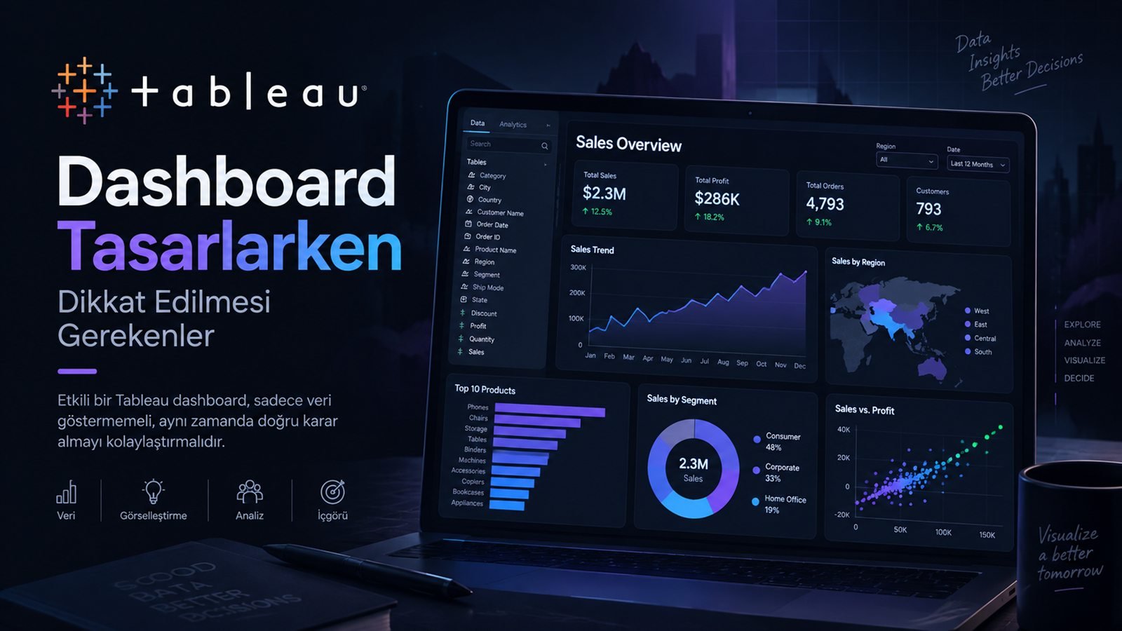
Tableau ile dashboard hazırlamak, birkaç grafik oluşturup bunları tek bir sayfada birleştirmekten çok daha fazlası. İyi bir dashboard; doğru soruya cevap verir, kullanıcıyı gereksiz detaylarla yormaz ve önemli bilgiyi birkaç saniye içinde görünür hale getirir.
Bu nedenle benim için dashboard tasarımının ilk sorusu “Hangi grafik türünü kullanmalıyım?” değil, “Kullanıcı bu ekranı açtığında hangi kararı verecek?” oluyor.
“İyi bir Tableau dashboard daha fazla veri göstermez; doğru içgörüyü daha hızlı gösterir.”
Tableau Dashboard Nedir?
Tableau dashboard; farklı worksheet'lerden, veri kaynaklarından ve görsel bileşenlerden oluşan tek bir etkileşimli analiz ekranıdır. Kullanıcı burada filtreler, görseller ve detaylar arasında etkileşime girerek veriyi keşfedebilir.
- Data Source
- Worksheet
- Dashboard
- Insight
1. Önce Kullanıcıyı ve Soruyu Tanımla
Yönetim, operasyon, pazarlama veya analitik ekipleri aynı dashboard'u aynı şekilde kullanmaz. Tableau tasarımına başlamadan önce hedef kullanıcının hangi sorulara cevap aradığını belirlemek gerekir.
Özet KPI'lar
Hedef, gerçekleşme, trend ve önemli sapmalar öne çıkmalı.
Detay ve filtre
Günlük takip ve kategori bazlı detaylara hızlı erişim gerekir.
Keşif
Drill-down, filtreleme ve farklı boyutları inceleme daha önemli olabilir.
Sade anlatım
Teknik ayrıntıdan çok ana sonuç ve görsel hikâye ön planda olmalı.
2. KPI'ları Dashboard'un Üstüne Taşımak
Tableau dashboard'da üst bölüm genellikle kullanıcının ilk baktığı alan. Bu nedenle burada çok sayıda metrik yerine en kritik birkaç KPI'ı göstermek daha etkili.
3. Doğru Tableau Görselini Seçmek
Tableau çok sayıda grafik türü sunuyor. Fakat teknik olarak yapılabilen her grafik dashboard'a eklenmek zorunda değil. Grafik, soruya göre seçilmeli.
| Analitik soru | Uygun görsel | Amaç |
|---|---|---|
| Zaman içinde ne oldu? | Line Chart | Trend |
| Hangi kategori önde? | Bar Chart | Karşılaştırma |
| İki değişken ilişkili mi? | Scatter Plot | İlişki |
| Dağılım nasıl? | Box Plot / Histogram | Dağılım |
| Coğrafi fark nerede? | Map | Lokasyon |
4. Tableau'da Görsel Hiyerarşi
Dashboard'un her bölümü aynı önemde görünmemeli. KPI → ana trend → detay → filtre mantığı, kullanıcıya doğal bir okuma akışı sağlayabilir.
5. Renkleri Anlamlı Kullanmak
Tableau dashboard tasarımında renk, sadece görsel güzellik için kullanılmamalı. Aynı rengin aynı anlamı taşıması, kullanıcının dashboard'u daha hızlı anlamasını sağlar.
6. Filter, Highlight ve Dashboard Actions
Tableau'nun en güçlü özelliklerinden biri etkileşim. Filter, highlight ve dashboard action'lar kullanıcının grafikleri keşfetmesini sağlar. Ancak her etkileşimi aynı anda eklemek dashboard'u karmaşıklaştırabilir.
- Tarih Filtresi
- Bölge
- Kategori
- Detay
7. Calculated Field Kullanımı
Tableau'da analiz mantığının önemli bölümü calculated field'lar üzerinden kurulabilir. Bu alanlar KPI, segment, koşul ve türetilmiş metrikleri oluşturmak için kullanılabilir.
// Satış Seviyesi

IF [Sales] >= 10000 THEN
    "Yüksek"

ELSEIF [Sales] >= 5000 THEN
    "Orta"

ELSE
    "Düşük"
END
8. Dashboard Performansı
Dashboard büyüdükçe performans konusu daha önemli hale gelir. Çok fazla worksheet, gereksiz veri, karmaşık hesaplamalar ve ağır filtreler kullanıcı deneyimini olumsuz etkileyebilir.
Gereksiz alanları azalt
İhtiyaç olmayan kolonları mümkün olduğunca modelden çıkar.
Görsel sayısını kontrol et
Her görselin gerçekten bir soruya cevap verdiğinden emin ol.
Hesapları sade tut
Tekrar eden ve gereksiz karmaşık hesaplamaları azalt.
Filtre yükünü azalt
Gereksiz veya çok pahalı filtreleri sınırlı tut.
9. Dashboard'u Test Etmek
Dashboard hazır olduğunda tasarıma bakmak yeterli değil. Gerçek kullanıcı gibi davranarak veri doğruluğu, filtreler, performans ve okunabilirlik test edilmeli.
Tableau Dashboard Tasarımında Yaygın Hatalar
| Hata | Problem | Daha iyi yaklaşım |
|---|---|---|
| Çok fazla worksheet | Dashboard kalabalıklaşır. | Her görselin tek bir amaca hizmet etmesi. |
| Fazla renk | Hiyerarşi kaybolur. | Sınırlı ve anlamlı palet kullanmak. |
| Filtre kalabalığı | Kullanıcı neyi değiştireceğini bilemez. | En sık kullanılan filtreleri öne almak. |
| Gereksiz detay | Ana mesaj görünmez olur. | Özet → trend → detay yapısı kurmak. |
| Performansı düşünmemek | Yavaş dashboard kullanıcıyı uzaklaştırır. | Veri, worksheet ve hesapları optimize etmek. |
Benim İçin İyi Bir Tableau Dashboard'un Özeti
Ne oldu?
Mevcut durum birkaç saniyede anlaşılabiliyor mu?
Neden oldu?
Filtre ve detaylarla sebebe inilebiliyor mu?
Ne yapmalıyım?
Dashboard aksiyonu ve karar vermeyi kolaylaştırıyor mu?
Güvenebilir miyim?
Veri ve hesaplamalar kontrol edilmiş mi?
Sonuç
Tableau ile etkili bir dashboard tasarlamak; sadece güzel grafikler üretmek değil, veri modelini, kullanıcı davranışını, görsel hiyerarşiyi, etkileşimleri ve performansı birlikte düşünmek demek.
Benim için iyi bir Tableau dashboard'un temel amacı şu: veriyi mümkün olduğunca çok göstermek değil, kullanıcıyı doğru içgörüye mümkün olan en kısa yoldan ulaştırmak.
“Başarılı dashboard, en çok grafik içeren değil; en doğru soruya en hızlı cevabı veren dashboard'dur.”
Building a dashboard in Tableau is much more than creating a few charts and putting them on one page. A good dashboard answers the right question, does not tire users with unnecessary detail and makes the important information visible within seconds.
That is why, for me, the first question of dashboard design is not “Which chart type should I use?” but “What decision will the user make when they open this screen?”
“A good Tableau dashboard doesn’t show more data; it shows the right insight faster.”
What Is a Tableau Dashboard?
A Tableau dashboard is a single interactive analysis screen made up of different worksheets, data sources and visual components. Users can explore the data by interacting with filters, visuals and details.
- Data Source
- Worksheet
- Dashboard
- Insight
1. Define the User and the Question First
Management, operations, marketing and analytics teams do not use the same dashboard in the same way. Before starting a Tableau design, you need to identify which questions the target user is trying to answer.
Summary KPIs
Targets, actuals, trends and significant deviations should stand out.
Detail and filters
Quick access to daily tracking and category-level detail is needed.
Exploration
Drill-down, filtering and examining different dimensions may matter more.
Clear storytelling
The main result and visual story should come before technical detail.
2. Moving KPIs to the Top of the Dashboard
In a Tableau dashboard, the top section is usually where users look first. So rather than many metrics, it is more effective to show a few of the most critical KPIs there.
3. Choosing the Right Tableau Visual
Tableau offers many chart types. But not every chart that can be built has to go on a dashboard. The chart should be chosen based on the question.
| Analytical question | Suitable visual | Purpose |
|---|---|---|
| What happened over time? | Line Chart | Trend |
| Which category leads? | Bar Chart | Comparison |
| Are two variables related? | Scatter Plot | Relationship |
| What does the distribution look like? | Box Plot / Histogram | Distribution |
| Where are the geographic differences? | Map | Location |
4. Visual Hierarchy in Tableau
Not every part of a dashboard should look equally important. A KPI → main trend → detail → filter structure can give users a natural reading flow.
5. Using Color Meaningfully
In Tableau dashboard design, color should not be used just for looks. When the same color always carries the same meaning, users understand the dashboard faster.
6. Filters, Highlights and Dashboard Actions
Interactivity is one of Tableau’s strongest features. Filters, highlights and dashboard actions let users explore the charts. But adding every interaction at once can make a dashboard complicated.
- Date Filter
- Region
- Category
- Detail
7. Using Calculated Fields
In Tableau, a large part of the analysis logic can be built with calculated fields. They can be used to create KPIs, segments, conditions and derived metrics.
// Sales Level

IF [Sales] >= 10000 THEN
    "High"

ELSEIF [Sales] >= 5000 THEN
    "Medium"

ELSE
    "Low"
END
8. Dashboard Performance
As a dashboard grows, performance becomes more important. Too many worksheets, unnecessary data, complex calculations and heavy filters can hurt the user experience.
Reduce unnecessary fields
Remove columns you do not need from the model wherever possible.
Control the number of visuals
Make sure every visual really answers a question.
Keep calculations simple
Reduce repeated and unnecessarily complex calculations.
Reduce filter load
Limit unnecessary or very expensive filters.
9. Testing the Dashboard
When the dashboard is ready, looking at the design is not enough. Data accuracy, filters, performance and readability should be tested by acting like a real user.
Common Mistakes in Tableau Dashboard Design
| Mistake | Problem | Better approach |
|---|---|---|
| Too many worksheets | The dashboard gets crowded. | Each visual serves a single purpose. |
| Too many colors | Hierarchy is lost. | Use a limited, meaningful palette. |
| Filter overload | Users don’t know what to change. | Bring the most used filters to the front. |
| Unnecessary detail | The main message disappears. | Build a summary → trend → detail structure. |
| Ignoring performance | A slow dashboard drives users away. | Optimize data, worksheets and calculations. |
My Summary of a Good Tableau Dashboard
What happened?
Can the current situation be understood in a few seconds?
Why did it happen?
Can you get to the cause with filters and details?
What should I do?
Does the dashboard make action and decision-making easier?
Can I trust it?
Have the data and calculations been checked?
Conclusion
Designing an effective dashboard in Tableau is not just about producing nice charts; it means thinking about the data model, user behavior, visual hierarchy, interactions and performance together.
For me, the core purpose of a good Tableau dashboard is this: not to show as much data as possible, but to get users to the right insight by the shortest possible route.
“A successful dashboard is not the one with the most charts; it is the one that answers the right question fastest.”