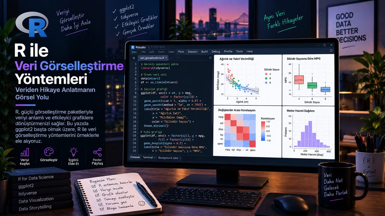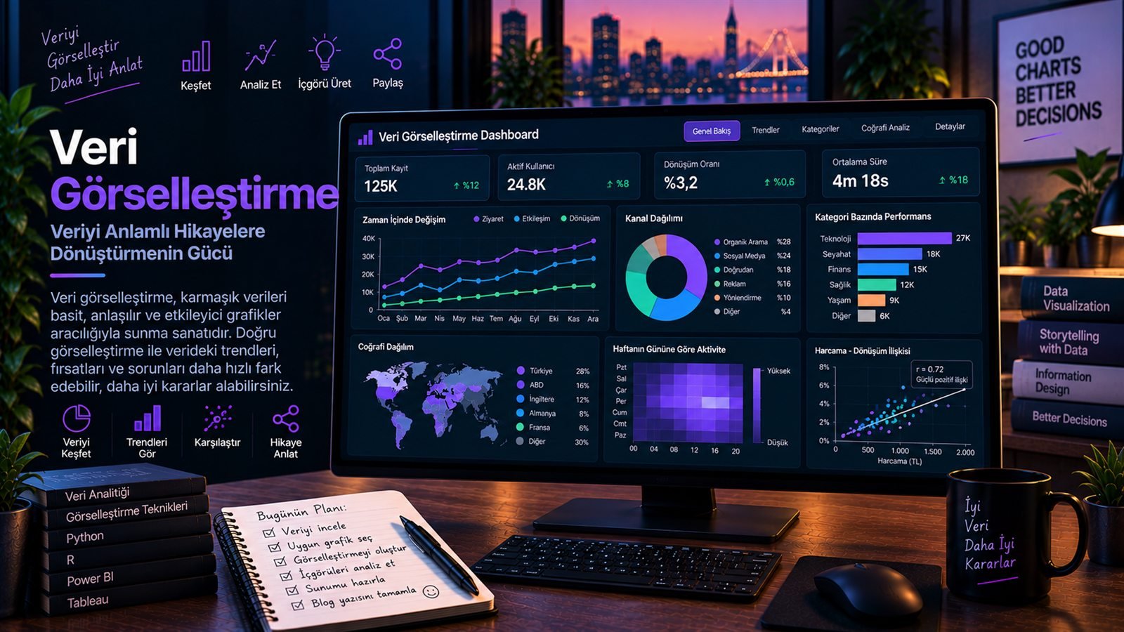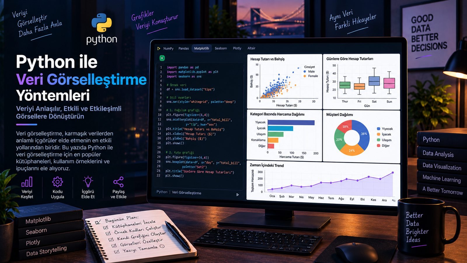
R ile Veri Görselleştirme: ggplot2 Temelleri
R ile etkileyici görselleştirmeler oluşturmak için ggplot2 paketinin temel kullanımını ele alıyorum.
- Veri Görselleştirme
- Araçlar
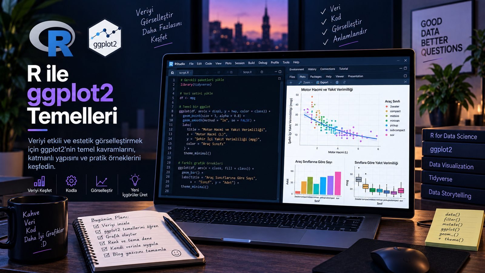
Veri analizi yalnızca sayıları hesaplamakla bitmez. Bir analiz sonucunun anlaşılabilir, akılda kalıcı ve doğru yorumlanabilir olması için veriyi iyi görselleştirmek gerekir.
R ekosisteminin en güçlü araçlarından biri olan ggplot2, veri görselleştirmeyi sistematik bir yapıya dönüştürür. Grafik oluştururken tek tek çizim komutları vermek yerine, verinin hangi değişkeninin hangi görsel özelliği temsil edeceğini tanımlarız.
“İyi bir grafik sadece güzel görünmez; verinin içindeki hikâyeyi daha hızlı görmemizi sağlar.”
ggplot2 Nedir?
ggplot2, R için geliştirilen ve “Grammar of Graphics” yaklaşımını temel alan bir veri görselleştirme paketidir. Bu yaklaşımda grafik; veri, estetik eşleştirmeler, geometrik katmanlar, ölçekler ve diğer bileşenlerin bir araya gelmesiyle oluşur.
1. İlk ggplot2 Grafiğini Oluşturmak
Başlangıç için üç temel parçayı bilmek yeterli: veri seti, aes() ile yapılan estetik eşleştirme ve grafik türünü belirleyen geom_* katmanı.
library(ggplot2)

ggplot(data = df, aes(x = tarih, y = satis)) +
  geom_line()
Bu örnekte tarih x eksenine, satış ise y eksenine bağlanıyor. geom_line() ise bu iki değişken arasındaki ilişkiyi çizgi grafik olarak gösteriyor.
2. aes() Neden Bu Kadar Önemli?
aes(), ggplot2'nin merkezindeki kavramlardan biri. Değişkenleri eksenlere, renklere, büyüklüklere veya diğer görsel özelliklere bağlamamızı sağlar.
ggplot(df, aes(
  x = kategori,
  y = satis,
  color = bolge,
  size = adet
)) +
  geom_point()
Böylece tek bir grafik üzerinde aynı anda birden fazla boyutu gösterebiliriz. Ancak her değişkeni grafiğe eklemek her zaman daha iyi bir sonuç vermez. Görselleştirmenin amacı karmaşıklığı artırmak değil, doğru bilgiyi daha hızlı aktarabilmektir.
3. En Çok Kullanılan Geom Katmanları
geom_point()
İki sayısal değişken arasındaki ilişkiyi noktalarla göstermek için kullanılır.
geom_line()
Zaman serileri ve sıralı gözlemlerde değişimi göstermek için idealdir.
geom_col()
Kategoriler arasındaki değer farklarını çubuklarla karşılaştırmak için kullanılır.
geom_boxplot()
Grupların dağılımını, medyanını ve aykırı değerlerini incelemeye yardımcı olur.
4. Örnek: Zaman İçinde Satışları Görselleştirmek
Zaman serilerinde çizgi grafik çoğu zaman iyi bir başlangıç noktasıdır. Ama grafiğin sadece çalışması değil, mesajını hızlı vermesi de gerekir.
ggplot(df, aes(x = tarih, y = satis)) +
  geom_line(linewidth = 1.2) +
  labs(
    title = "Aylık Satış Trendi",
    x = "Tarih",
    y = "Satış"
  ) +
  theme_minimal()
5. Renkleri Doğru Kullanmak
Renk, veri görselleştirmede güçlü ama dikkat edilmesi gereken bir araçtır. Kategorileri ayırmak için kullanılabilir; fakat anlamsız şekilde fazla renk kullanmak grafiğin okunabilirliğini azaltabilir.
| İhtiyaç | Yaklaşım |
|---|---|
| Kategorileri ayırmak | Az ve anlamlı renk paleti |
| Bir büyüklüğü göstermek | Sürekli renk skalası |
| Önemli bir noktayı vurgulamak | Tek vurgu rengi |
| Sunum / rapor tutarlılığı | Kurumsal renk paleti |
6. Facet ile Veriyi Küçük Grafiklere Ayırmak
Bazen tek bir grafik çok fazla bilgi taşır. Bu durumda facet_wrap() veya facet_grid() kullanarak veriyi alt grafiklere ayırabiliriz.
ggplot(df, aes(x = tarih, y = satis, color = kanal)) +
  geom_line() +
  facet_wrap(~ bolge) +
  theme_minimal()
Böyle bir yaklaşım, özellikle bölge, ürün, kanal veya müşteri segmenti gibi kategoriler arasında karşılaştırma yaparken oldukça kullanışlıdır.
7. Grafik Sadece Kod Değildir
Teknik olarak çalışan bir grafik, iyi bir veri görselleştirmesi olmak zorunda değil. Başlık, eksen adları, sayı formatları, açıklamalar, boşluklar ve renk seçimleri de analizin bir parçasıdır.
Mesajı belirle
Grafikten okuyucunun hangi sonuca ulaşmasını istediğini netleştir.
Doğru grafik türünü seç
Trend için çizgi, karşılaştırma için çubuk, ilişki için saçılım grafiği düşün.
Gereksiz süslemeyi azalt
Grafiğin amacı tasarım yarışması kazanmak değil, bilgiyi aktarmaktır.
Okunabilirliği test et
Grafiğe birkaç saniye baktığında ana mesaj anlaşılabiliyor mu?
ggplot2 Öğrenirken Benim İçin En Önemli Yaklaşım
ggplot2'yi öğrenirken komutları tek tek ezberlemek yerine grafiklerin nasıl katmanlardan oluştuğunu anlamak çok daha faydalı. Önce veriyi seçmek, sonra estetik eşleştirmeleri tanımlamak, ardından uygun geom'u eklemek ve son olarak grafiği okunabilir hale getirmek daha sürdürülebilir bir çalışma biçimi.
“ggplot2'nin gücü, tek bir grafik komutunda değil; küçük ve anlaşılır katmanları bir araya getirebilmesinde.”
Sonuç
ggplot2, R ile veri görselleştirmeye başlamak için güçlü ve esnek bir araç. Temel mantığını kavradığınızda çizgi grafiklerden dağılım grafiklerine, kategorik karşılaştırmalardan çoklu panellere kadar oldukça geniş bir görselleştirme dünyasına geçiş yapabilirsiniz.
Fakat en iyi grafik, en fazla kod yazılan grafik değildir. En iyi grafik, verinin içindeki önemli bilgiyi en anlaşılır biçimde ortaya çıkaran grafiktir.
Data analysis does not end with calculating numbers. For the result of an analysis to be understandable, memorable and correctly interpreted, the data has to be visualized well.
ggplot2, one of the most powerful tools in the R ecosystem, turns data visualization into a systematic structure. Instead of issuing drawing commands one by one, we define which variable of the data should represent which visual property.
“A good chart doesn’t just look nice; it helps us see the story in the data faster.”
What Is ggplot2?
ggplot2 is a data visualization package for R based on the “Grammar of Graphics” approach. In this approach, a chart is built by combining data, aesthetic mappings, geometric layers, scales and other components.
1. Creating Your First ggplot2 Chart
To get started, you only need three basic pieces: a data set, an aesthetic mapping defined with aes() and a geom_* layer that sets the chart type.
library(ggplot2)

ggplot(data = df, aes(x = date, y = sales)) +
  geom_line()
In this example, date is mapped to the x axis and sales to the y axis. geom_line() then shows the relationship between these two variables as a line chart.
2. Why Is aes() So Important?
aes() is one of the central concepts of ggplot2. It lets us map variables to axes, colors, sizes or other visual properties.
ggplot(df, aes(
  x = category,
  y = sales,
  color = region,
  size = quantity
)) +
  geom_point()
This way we can show several dimensions on a single chart at the same time. But adding every variable to a chart does not always give a better result. The goal of visualization is not to add complexity, but to convey the right information faster.
3. The Most Common Geom Layers
geom_point()
Shows the relationship between two numeric variables with points.
geom_line()
Ideal for showing change in time series and ordered observations.
geom_col()
Compares value differences between categories with bars.
geom_boxplot()
Helps examine group distributions, medians and outliers.
4. Example: Visualizing Sales over Time
For time series, a line chart is often a good starting point. But a chart should not only work; it should also get its message across quickly.
ggplot(df, aes(x = date, y = sales)) +
  geom_line(linewidth = 1.2) +
  labs(
    title = "Monthly Sales Trend",
    x = "Date",
    y = "Sales"
  ) +
  theme_minimal()
5. Using Color Well
Color is a powerful tool in data visualization, but it has to be used with care. It can separate categories, yet using too many colors without a reason makes a chart harder to read.
| Need | Approach |
|---|---|
| Separating categories | A small, meaningful color palette |
| Showing a magnitude | A continuous color scale |
| Highlighting a key point | A single accent color |
| Consistency in presentations / reports | A corporate color palette |
6. Splitting Data into Small Charts with Facets
Sometimes a single chart carries too much information. In that case we can split the data into sub-charts with facet_wrap() or facet_grid().
ggplot(df, aes(x = date, y = sales, color = channel)) +
  geom_line() +
  facet_wrap(~ region) +
  theme_minimal()
This approach is especially useful when comparing categories such as regions, products, channels or customer segments.
7. A Chart Is Not Just Code
A chart that works technically is not necessarily a good data visualization. Titles, axis names, number formats, annotations, spacing and color choices are all part of the analysis.
Define the message
Be clear about the conclusion you want the reader to reach from the chart.
Choose the right chart type
Think lines for trends, bars for comparisons and scatter plots for relationships.
Cut unnecessary decoration
The goal of a chart is to convey information, not to win a design contest.
Test readability
Can the main message be understood after looking at the chart for a few seconds?
The Approach That Helped Me Most While Learning ggplot2
When learning ggplot2, understanding how charts are built from layers is far more useful than memorizing commands one by one. Choosing the data first, then defining the aesthetic mappings, adding the right geom and finally making the chart readable is a much more sustainable way of working.
“The power of ggplot2 is not in a single chart command, but in combining small, understandable layers.”
Conclusion
ggplot2 is a powerful and flexible tool for getting started with data visualization in R. Once you grasp its core logic, you can move into a wide world of visualization, from line and scatter charts to categorical comparisons and multi-panel plots.
But the best chart is not the one with the most code. The best chart is the one that brings out the important information in the data most clearly.